
CSS Grid 是一個 layout framework,
雖然多數新屬性僅有主流瀏覽器版本才有支援,但是具有未來性的東西,還是值得學,將陸續整理一些相關介紹及用法
這裡Grid建構原型相關圖片及範例主要參考自 Per Harald Borgen 這篇,有興趣的話,可以看看原始全文內容,介紹會更加詳細
接下來,開始介紹如何使用 Grid 建構原型
Grid 基本排版
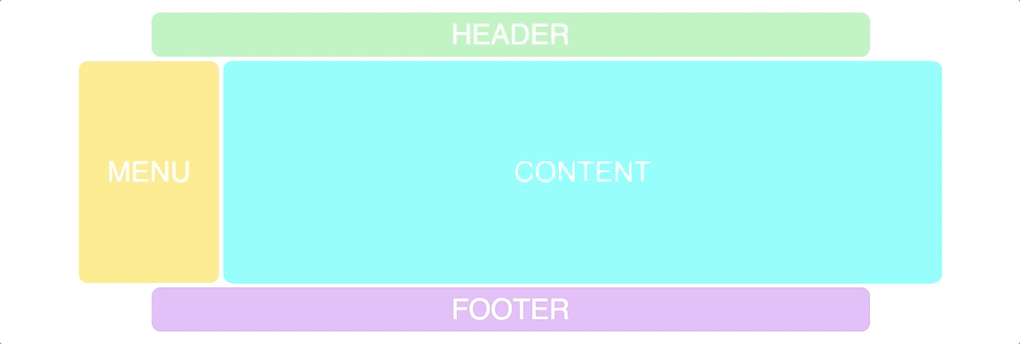
首先,要知道建構版面的架構,這樣我們才能依照藍圖來建構網站原型,這裡先依照下圖來進行建構基本版面
先建立對應的 HTML 架構以及 class 標記
<div class="container">
  <div class="header">HEADER</div>
  <div class="menu">MENU</div>
  <div class="content">CONTENT</div>
  <div class="footer">FOOTER</div>
</div>
接下來透過 CSS Grid 來做第一次的基本排版,
用 grid-template-columns 設定 Grid 格數,grid-template-rows 個別設定三行的高度
接這就能直接透過 grid-template-areas 先設定矩陣網格,非常直覺,並且好管理
其中的字符 h, m, c, f 主要是方便對應 header, menu, content, footer
.container {
    display: grid;
    grid-gap: 5px;
    grid-template-columns: repeat(12, 1fr);
    grid-template-rows: 50px 350px 50px;
    grid-template-areas:
        "h h h h h h h h h h h h"
        "m m c c c c c c c c c c"
        "f f f f f f f f f f f f";
}
.header {
    grid-area: h;
}
.menu {
    grid-area: m;
}
.content {
    grid-area: c;
}
.footer {
   grid-area: f;
}
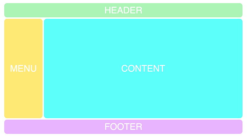
這樣,設定完成之後,基本版面就出來了
進行一次 Grid 微調
接下來,將版面進行微調成底下圖示
header、footer 要做到前後縮排,以及 menu 與 content 位置對調
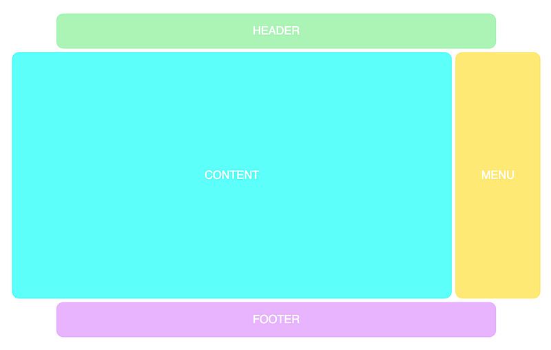
header、footer 要做到前後縮排: grid-template-areas 的設定可以用 “.” 來表示,在排版時就會空出來 menu 與 conetents 位置對調: 直接將 c與m的矩陣進行調整即可
.container{
		grid-template-areas:
        “. h h h h h h h h h h .”
        "c c c c c c c c c c m m”
        “. f f f f f f f f f f .”;
}
響應式Grid
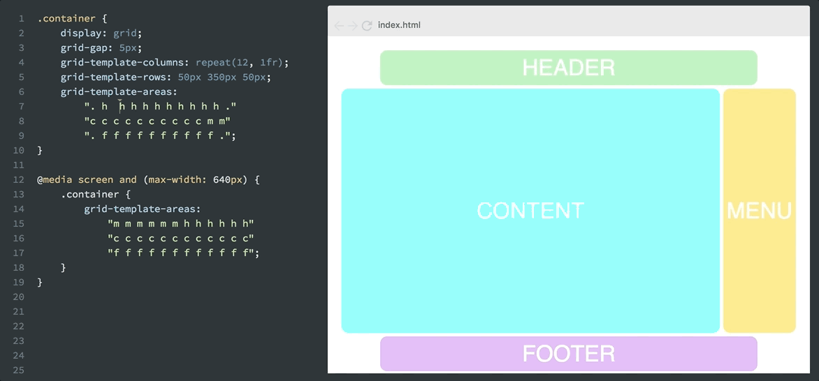
.container {
    display: grid;
    grid-gap: 5px;
    grid-template-columns: repeat(12, 1fr);
    grid-template-rows: 50px 350px 50px;
    grid-template-areas:
          ". h h h h h h h h h h ."
          "c c c c c c c c c c m m"
          ". f f f f f f f f f f .";
}
@media screen and (max-width: 640px) {
  .container{
    grid-template-areas:
        "m m m m m m h h h h h h"
        "c c c c c c c c c c c c"
        "f f f f f f f f f f f f";

  }
}
.header {
    grid-area: h;
}
.menu {
    grid-area: m;
}
.content {
    grid-area: c;
}
.footer {
   grid-area: f;
}
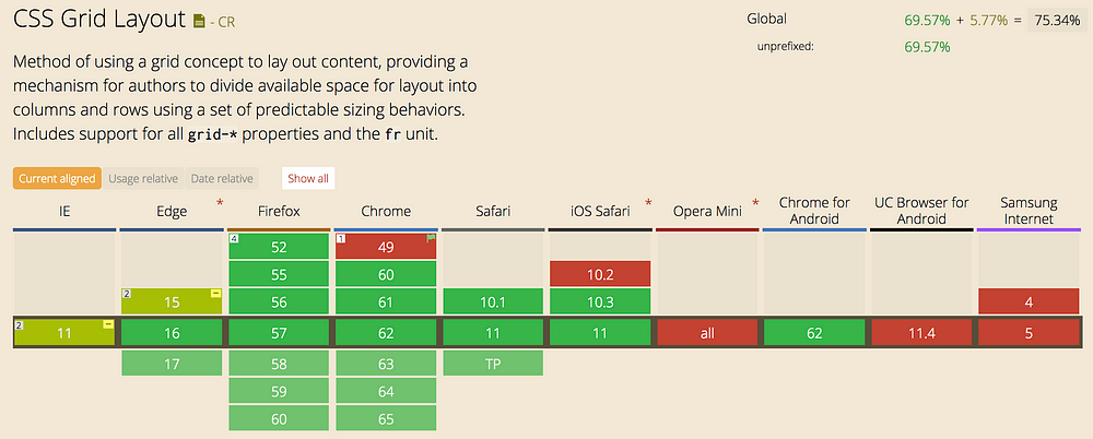
Grid 瀏覽器支援
參考 Per Harald Borgen - How to prototype websites quickly with CSS Grid